Not So Serious is a premium Indian fashion label by Pallavi Mohan. It is a confluence of western and Indian techniques with interesting colours and mixed media, representing feminine sensibilities.
With the launch of its first flagship retail store, Not So Serious wanted to enhance its brand experience and provide its patrons with a space in which to interact with and appreciate the brand. This transformation was also utilised to align the label’s brand values, interior design and visual brand identity.
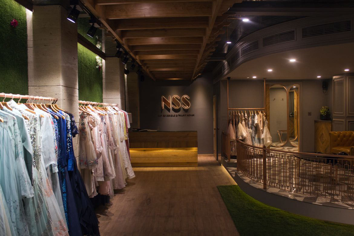
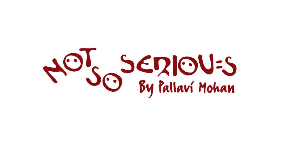
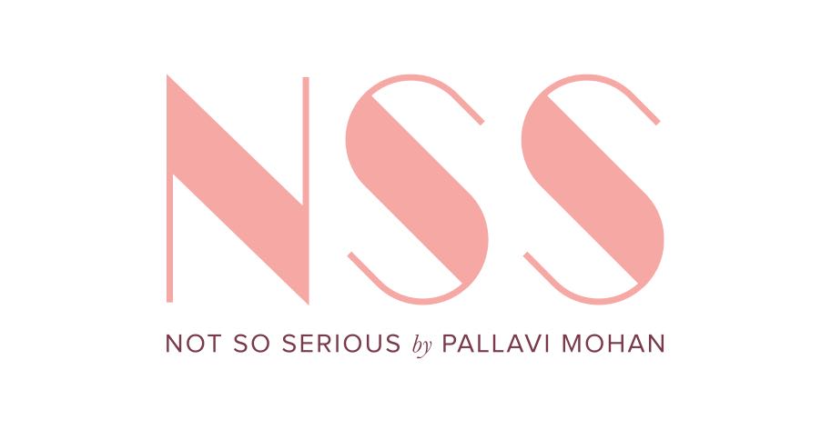
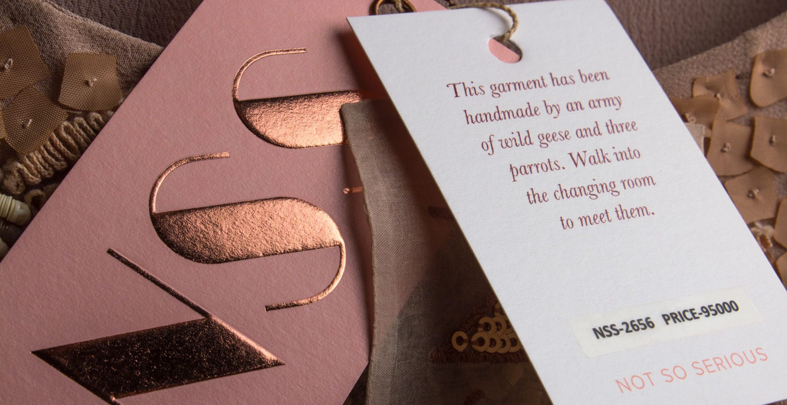
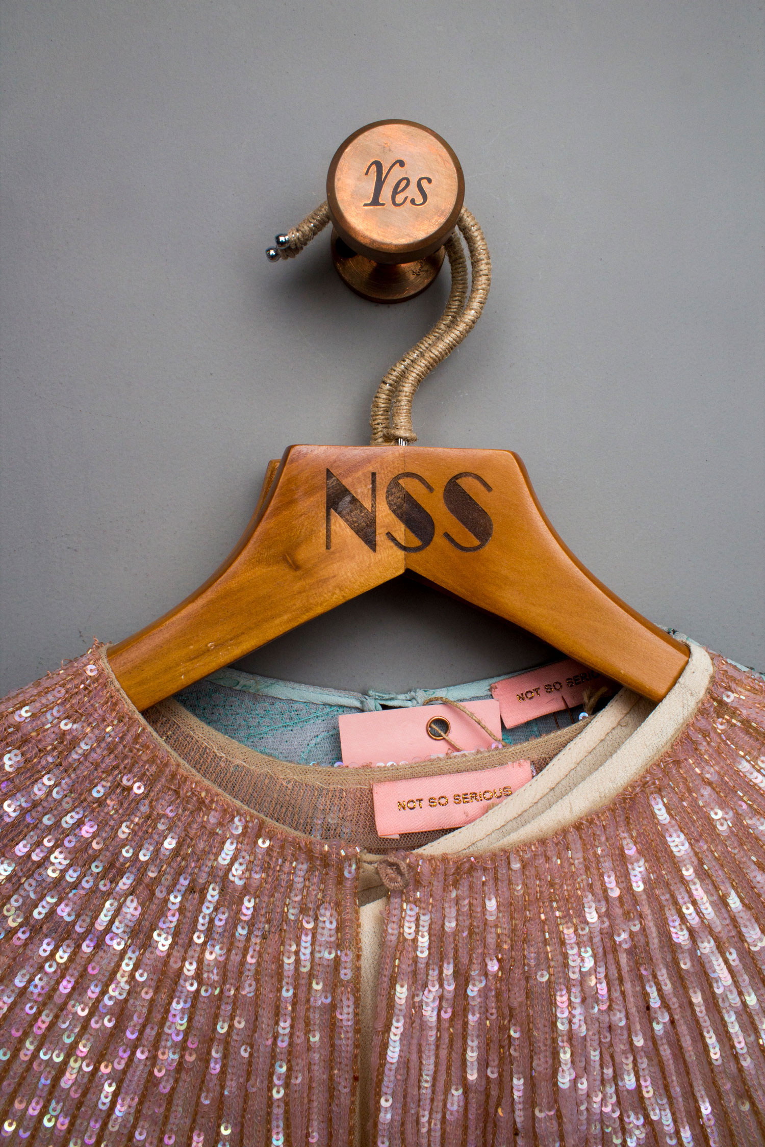
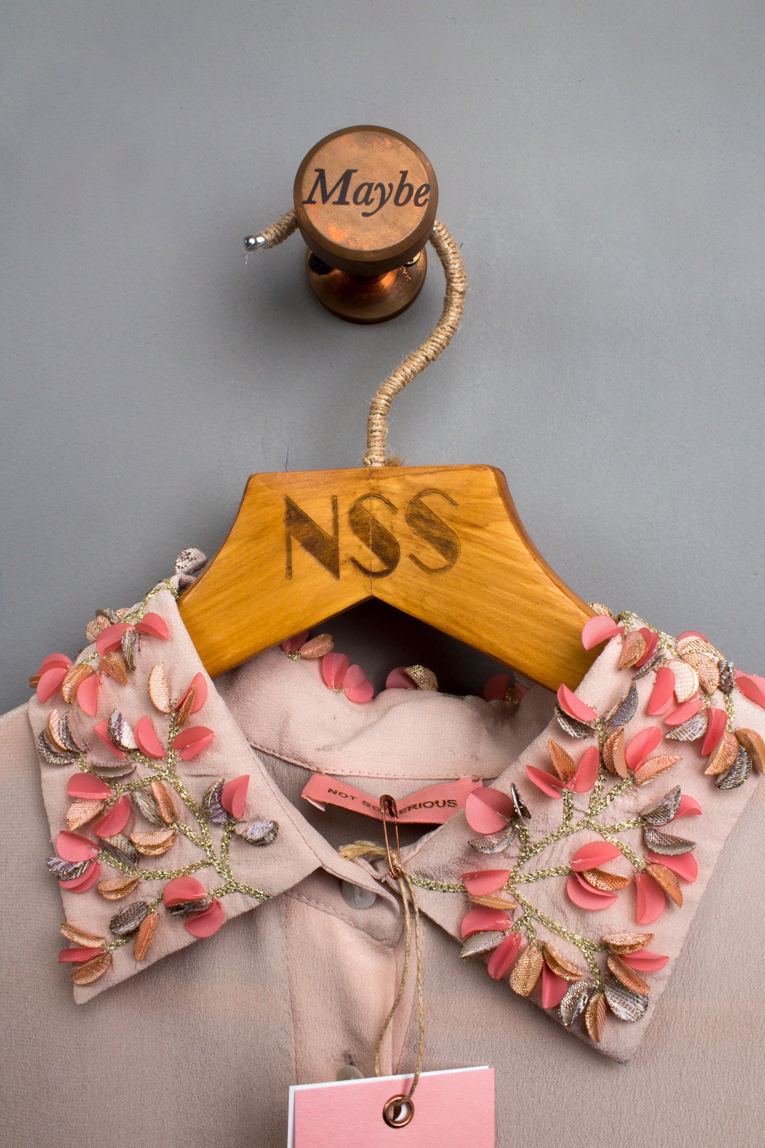
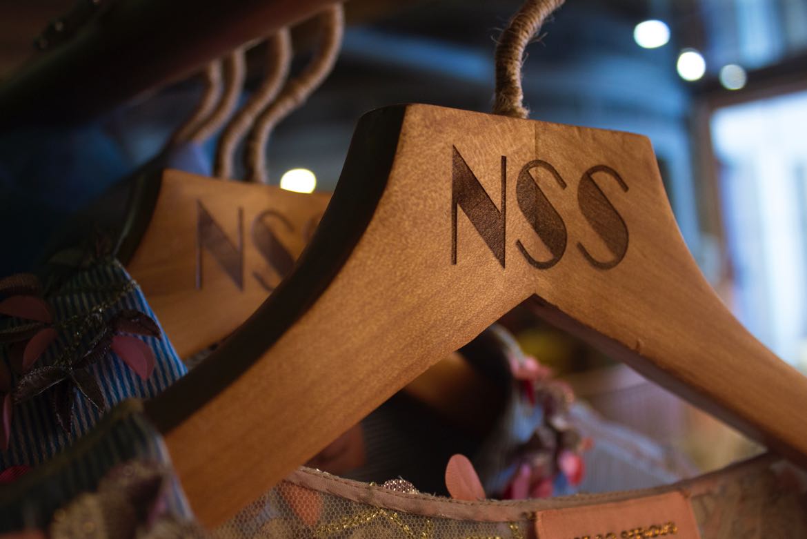
The new visual identity of Not So Serious had to communicate luxury and class yet an aspect of quirkiness and individuality. The outcome was a finely sculpted bespoke NSS monogram with contrasting thicks and thins juxtaposed with a symmetrical and debonair Not So Serious logotype.
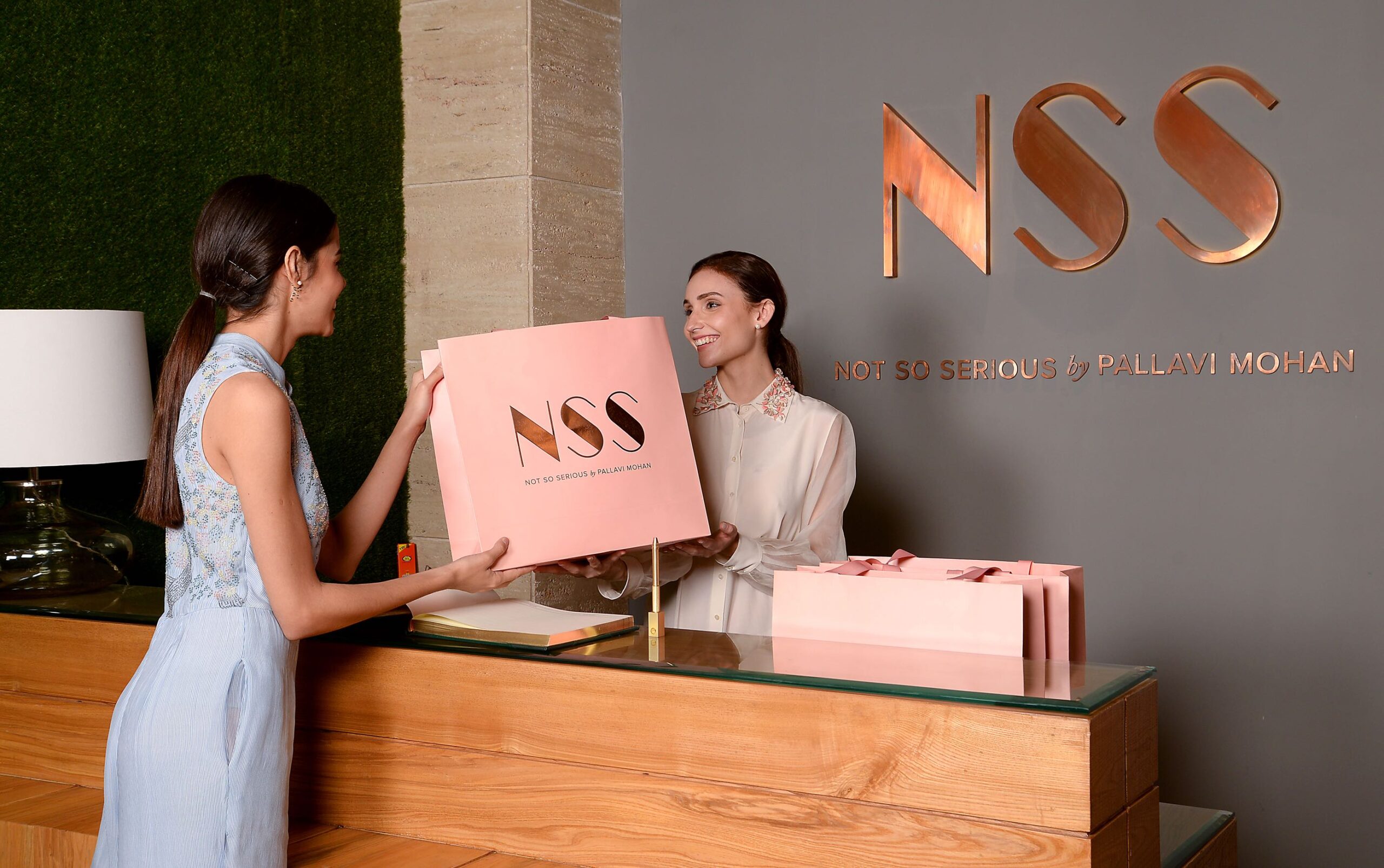
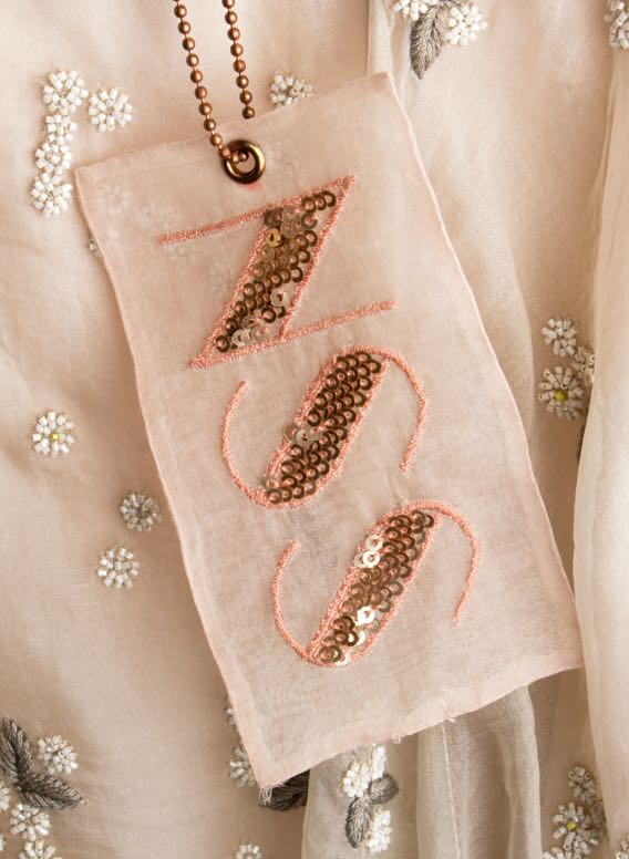
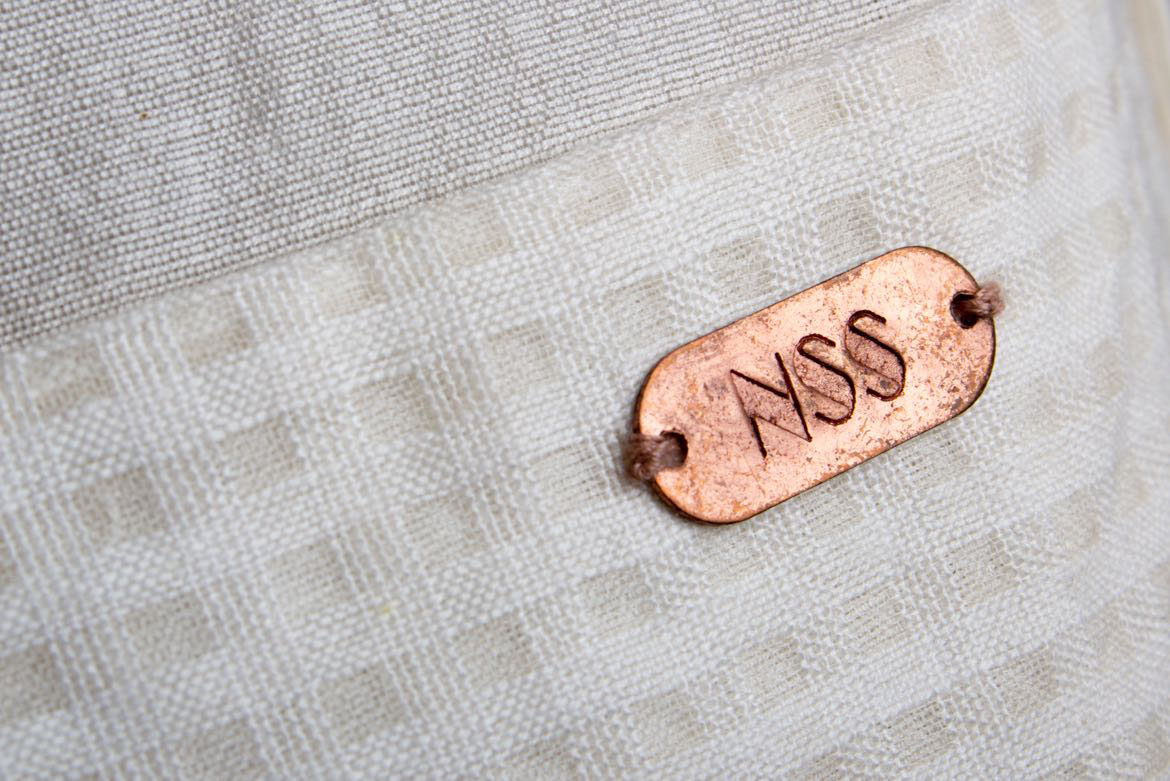
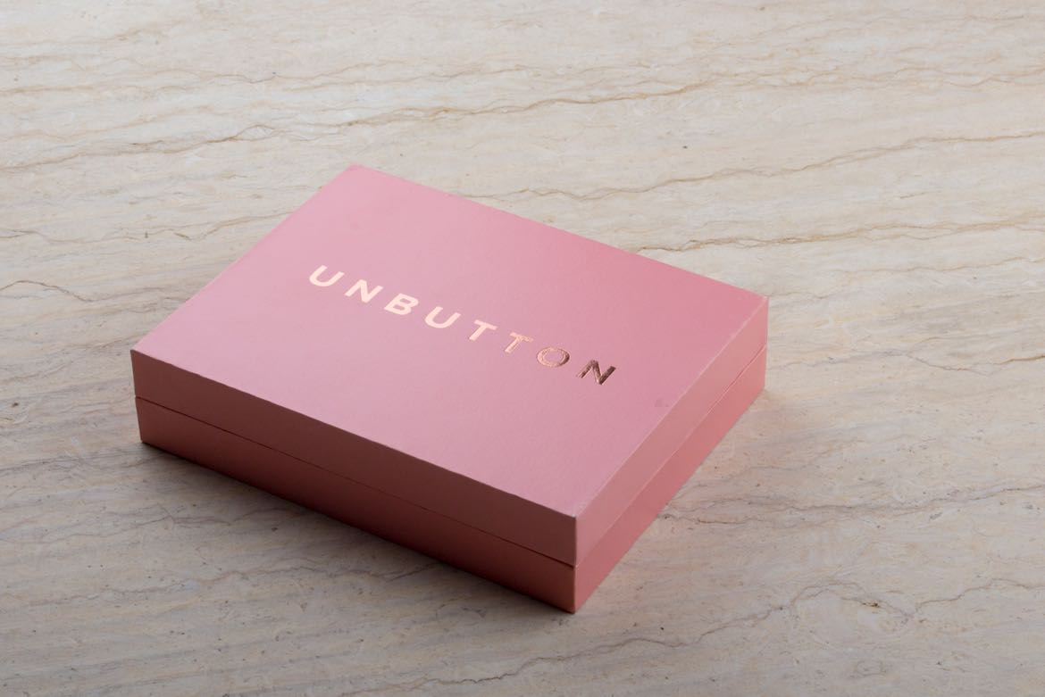
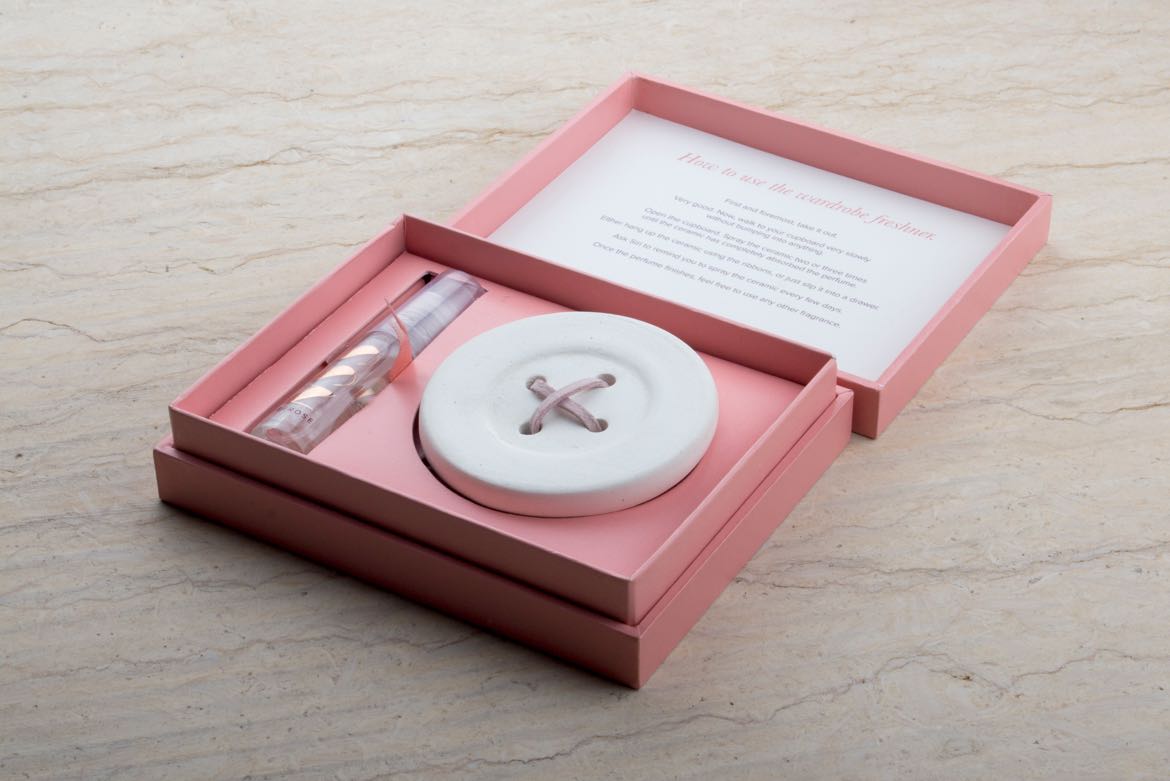
While the logo was kept sharp and serious, the extended brand communication had elements of quirkiness and wit to make people smile. The messages on the garment tags, hangers in the changing room and other such touch points humanised the brand and made it an immersive experience.
Contact
Melbourne, Victoria
Phone: +61 451 028 900
Email: raghavkumaaar@gmail.com
Instagram: @raghavkumaaar
© Raghav Kumar 2024